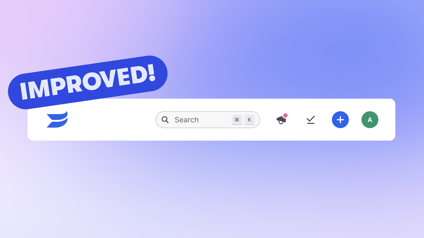
✨ Main navigation glow up
timestamp1710443889480

Have you seen our brand’s new look and feel? While we could geek out about branding for a long time, our recent refresh wasn’t just about looks; it’s about making your experience with our app more efficient, accessible, and fun.
Our new brand identity is bold, playful, and designed with accessibility in mind, ensuring that every user can navigate and use all of our features with ease. To that end, we had some work to do to make navigating Wistia more streamlined.

Enhanced navigation
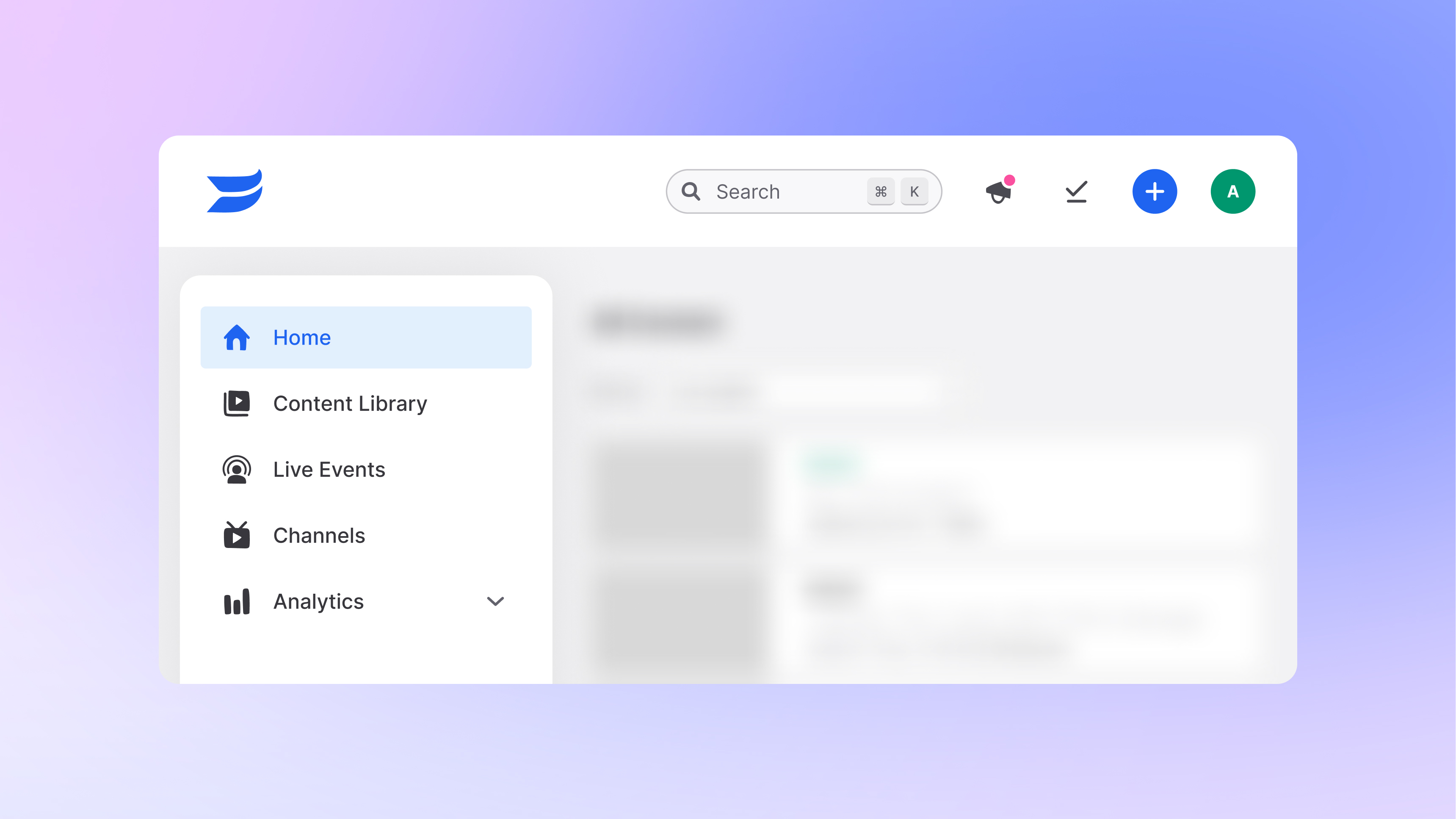
We've given our main navigation a major overhaul. While you'll find most functionalities exactly where you expect them, we've streamlined access to key product areas such as the Content Library, Account Analytics, Channels, and Live features. Our goal? To help you work more efficiently by simplifying the pathways to what you need.
Easy uploading, important, and recording
Now, you can start uploading, recording, or importing new media to your account from any page within the app. It's all about making the process smoother, so you can focus on creating great content.
Private user sessions added to Settings
We've moved the Private User Sessions feature. You'll now find this option nestled within the Settings menu, making it straightforward to monitor your account activity.
Support at your fingertips
Need help? The Support widget is always available in the lower right corner of every page, ensuring you have assistance whenever you need it.
And that’s it! Stay tuned as we continue to make your experience easier and more streamlined across all of Wistia.
Did you like this update?
![]()
![]()
![]()
Leave your name and email so that we can reply to you (both fields are optional):
