Updated Channel Editor User Experience
timestamp1613485815007
Improvement
Today we released an updated user experience for the Channel Editor!
After combing through user feedback and thinking about the information architecture of this area of our product, we landed on some design and organization updates that we feel will make it both easier and faster for you to customize and update your Channel options.
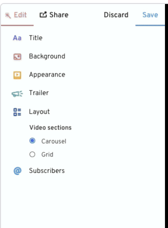
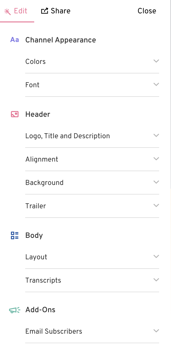
Below is a screenshot of the before and after.
Before:

After:

Now, we’ve organized the options roughly by the area they impact, global styles, and marketing add-ons to make it clearer. Keep an eye out, as this update paves the way for more exciting improvements in the future!
Did you like this update?
![]()
![]()
![]()
{error_message}
Leave your name and email so that we can reply to you (both fields are optional):
Thanks for your feedback!
