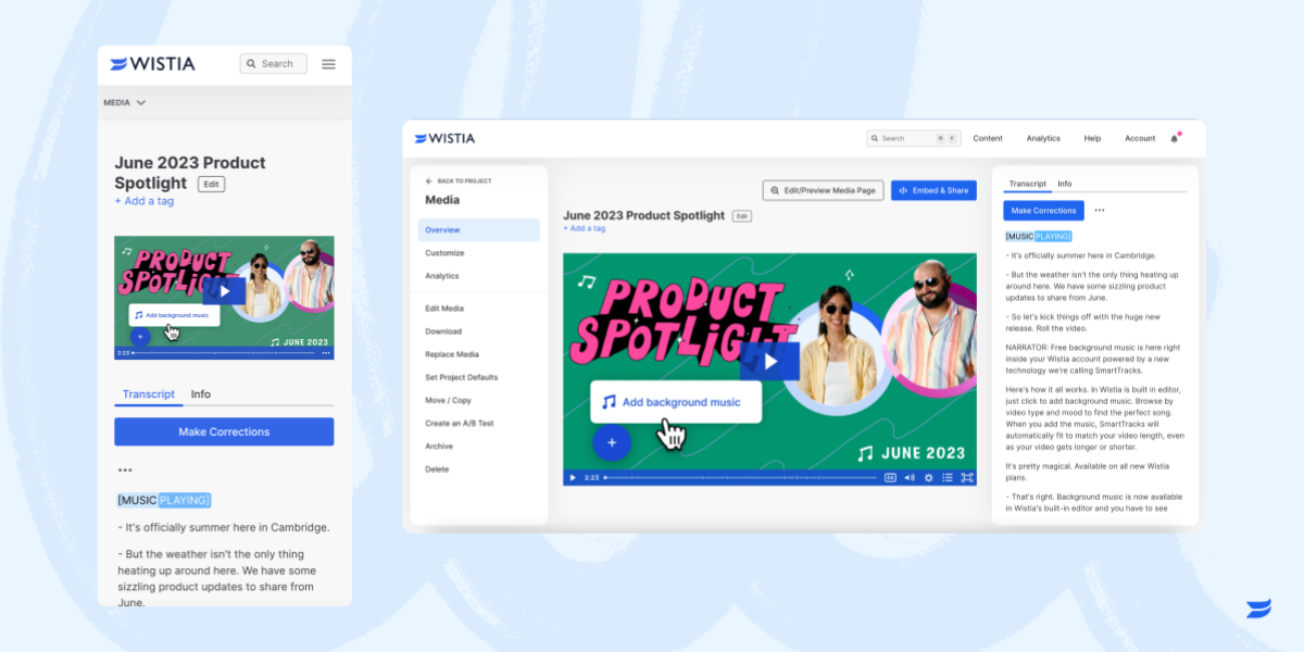
▶️ Your media page, made better
timestamp1689166800000
We’ve made some important updates to the Media Page when you’re logged into Wistia. The TL;DR? We’ve updated the layout, made the page responsive, and tackled some infrastructure updates to set us up to release some exciting features in the future. 🔮
While a lot of this work was done on the back end of Wistia, there are a few things you’ll notice on the surface, too. Check ‘em out:
Dialing in responsiveness for a better experience
The new Media Page is responsive across different browser sizes and devices. It doesn’t just look good, the updated responsiveness helps you view and take action on your media no matter what setup you use. Yep, that means we better support the media page on mobile, large displays, and everything in between.

Streamlining your view with a smarter layout
We've also made small tweaks to the Media Page layout to support some of the exciting features to come (no spoilers, sorry).
We’ve moved your Title, Description, and Tags above the video to make it easier to see at a glance.
We’ve introduced tabs for Transcripts, Comments, and Info so you can toggle to get the information you’re after.
We’ve also reordered the items in the left-hand side nav to make things easier to navigate between.
Surfacing more metadata for you to dig into
What’s that “Info” tab we talked about above? Glad you asked. We’ve put more info about your media in a section aptly named, “Info.” On this tab, you’ll see details about the media, like who uploaded it, the duration, file size, play counts, and links to see where it’s embedded.
There you have it—a more streamlined, easier-to-use, and more powerful Media Page.
Did you like this update?
![]()
![]()
![]()
Leave your name and email so that we can reply to you (both fields are optional):
